Home Web Designing Color Theory & Color Contrast
Color Theory and Contrast Banner

Color Theory & Color Contrast

Book You're Free Demo Classes Today!

Join Best Digital Marketing Institute of Patiala!

Share To:

Introduction

Colors play a powerful role in how users perceive a design. Poor color choices can weaken brand identity, reduce readability, and harm user experience, while the right use of color makes designs clear, engaging, and trustworthy. This is where color theory and color contrast become essential, helping you understand how colors interact, communicate emotions, and remain readable and accessible across devices.

In this article, you will learn the fundamentals of color theory, key elements, common color schemes, and the importance of color contrast in modern design. You’ll also discover how you can use colors effectively to improve usability, accessibility, branding, and overall user experience, along with practical tips, real-world examples, and common mistakes to avoid.

What is Color Theory?

What is Color Theory?

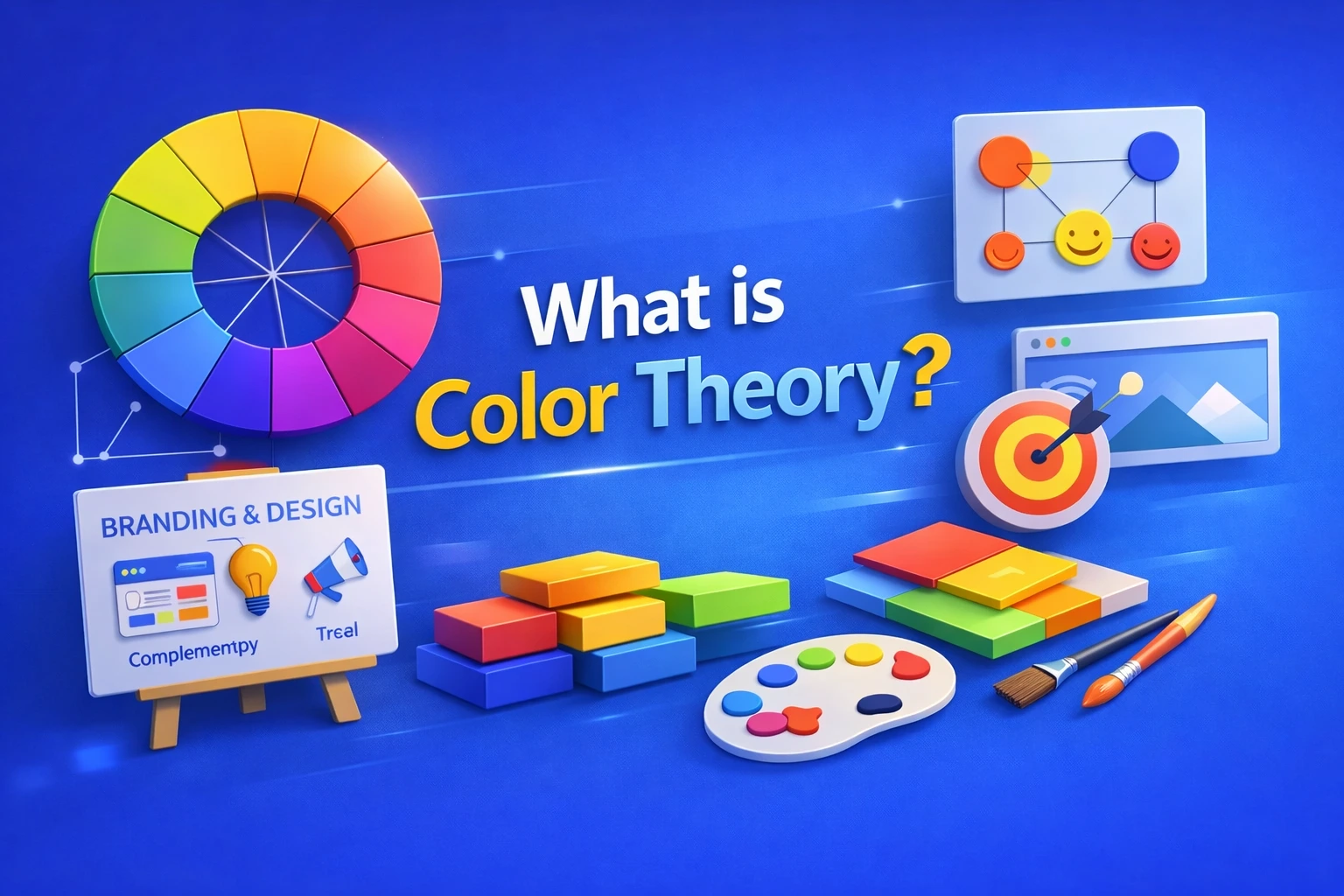
Color theory is essential to branding and design because it helps you convey emotions, guide users’ attention, and improve the usability of websites, logos, advertisements, and user interface designs.

In this article, we will cover the fundamentals of color theory, its key elements, major color schemes, color contrast, and how you can apply them together in contemporary design to create better experiences for users.


Key elements of color theory

Key Elements of Color Theory
  1. Color Wheel:

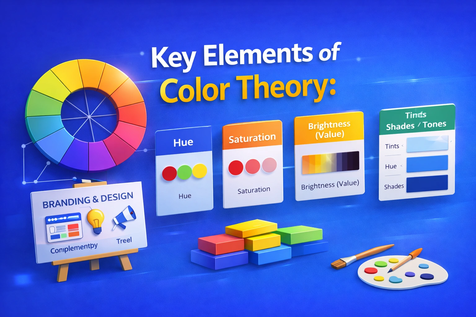
The basis of color theory is the color wheel. It helps you select harmonious color combinations and understand the relationship between different colors.

It consists of:

      • Primary colors (Red, Blue, Yellow)
      • Secondary colors (Green, Orange, Purple)
      • Tertiary colors (mix of primary and secondary)
  1. Hue:

The term hue describes a color’s pure form, such as red, blue, or green. It helps you identify a color’s basic characteristics without considering brightness or saturation.

      • Red → energy, urgency, passion

      • Blue → trust, calm, professionalism

      • Yellow → optimism, warmth

      • Green → nature, growth, balance

      • Black → luxury, power

      • White → simplicity, cleanliness

  1. Saturation:

Saturation is used to describe a color’s intensity or purity, helping you decide how vibrant or muted a color appears to users.

      • High saturation → vibrant and bold
      • Low saturation → muted and dull
  1. Brightness (Value):

A color’s value shows how light or dark it is, allowing you to create depth, contrast, and visual balance in your designs.

      • Softness is produced by light values
      • Dark hues provide contrast and depth

Color Variations

  • Tints:

    Created when you add white to a hue (pure color), helping you produce lighter and softer colors for users.

Tints: Hue(Pure Color)+White

  • Shades:

Formed when you add black to a hue, allowing you to create darker and deeper colors.

Shades: Hue+Black

  • Tones:

Made by adding gray to a hue, helping you achieve muted and balanced colors that feel comfortable for users.

Tones:Hue+Grey

Purpose of color theory

Purpose of Color Theory

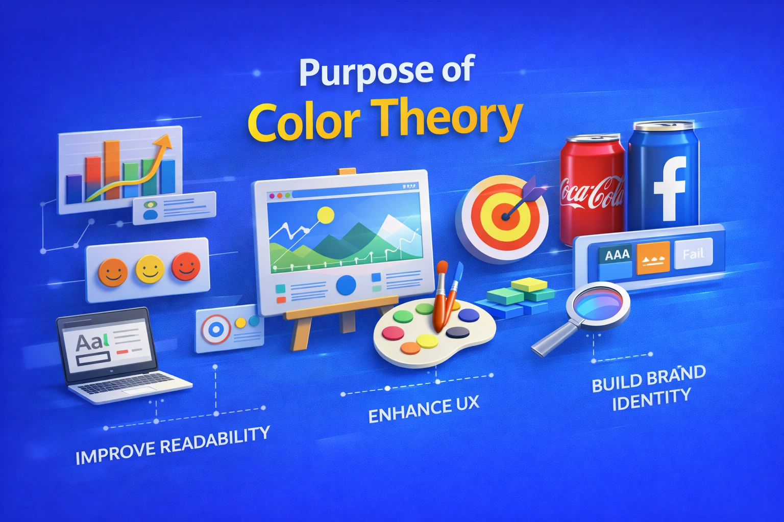
The goal of color theory is to make it easier for you and us understand how colors interact and influence people’s feelings, perceptions, and actions. Correct application of color theory allows us to produce designs that are not confusing or unpleasant, but rather balanced, appealing, and meaningful.
Color theory helps you and us select color schemes that enhance communication, readability, and visual harmony. It facilitates users’ ability to absorb information, focusing on key components, and emotionally relate to a design. Color theory enables us to impact mood, emphasize important messages, create brand identity, and enhance user experience in fields including graphic design, web design, branding, and marketing.

Tips for using color theory effectively

Tips for using Color Theory Effectively

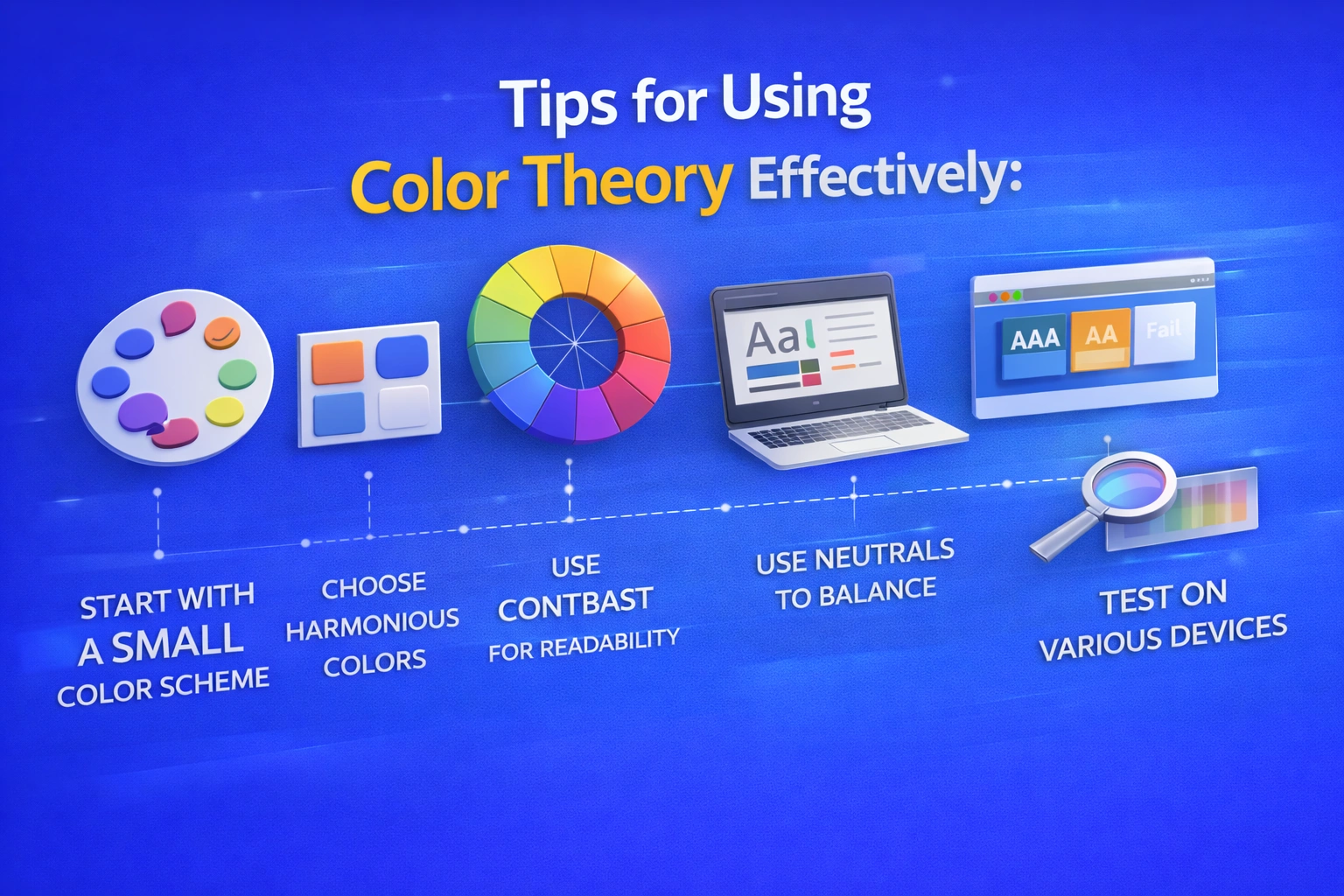
In order to successfully include color theory into your designs, you should:

  • To keep your design clean and balance, start with a small color scheme.
  • To choose harmonious color combinations like complimentary, analogous or triadic hues use the color wheel.
  • Use contrast carefully to keep your text and key components readable.
  • Whether your design is quiet, vibrant, professional or playful, pick colors that complement its attitude and goal.
  • Users may become confused if you utilize too many vivid or highly saturated colors at once.
  • Use neutral hues like white, black, and gray to balance bright or vibrant shades.
  • To guarantee visual consistency, test your color combinations on various displays and devices.
  • Verify that your design complies with accessibility guidelines by examining color contrast ratios.
  • Use text, patterns or icons to supplement color when communicating ideas.
  • Use the same color scheme for all platforms and materials to keep your brand consistent.

Uses of color theory

Uses of Color Theory

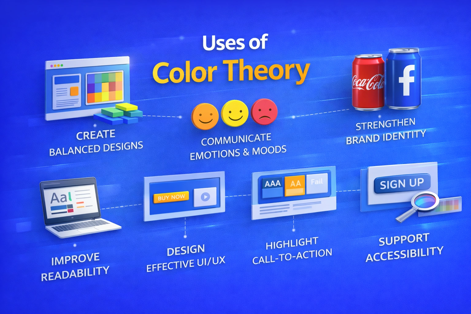
Color theory helps you apply colors effectively across different design fields. You can use it to:

  • Create visually appealing and balanced designs, such as when you use harmonious color palettes in website layouts and posters.
  • Communicate emotions and moods through color choices, like when you use blue to build trust in banking apps or red to create urgency in sale banners for users.
  • Strengthen brand identity by applying consistent brand colors, as you see with brands like Coca-Cola’s red or Facebook’s blue.
  • Improve readability and clarity by using dark text on light backgrounds so users can easily read blogs, news websites, and mobile apps.
  • Design effective user interfaces (UI) by guiding users’ attention, such as when you highlight primary buttons with contrasting colors.
  • Enhance user experience (UX) by reducing eye strain for users, for example by using soft backgrounds and balanced contrast in reading apps.
  • Highlight important elements like call-to-action buttons, such as “Buy Now” or “Sign Up” buttons that guide users on e-commerce websites.
  • Support accessibility by ensuring proper contrast so users with visual impairments can read content on government and educational websites.
  • Increase engagement and conversions by using color strategically in marketing designs, such as bright, contrasting colors that encourage users to click on ads.

Maintain visual consistency for users across platforms by using the same color palette on websites, mobile apps, social media posts, and packaging.

Types of color schemes

Types of Color Schemes

1. Monochromatic

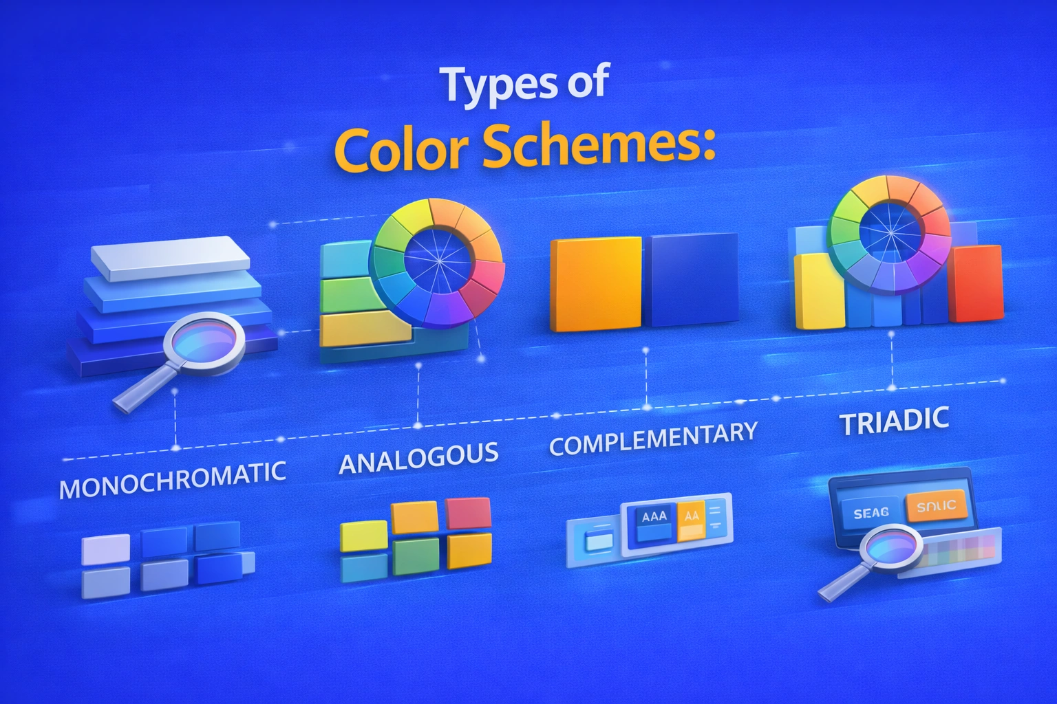
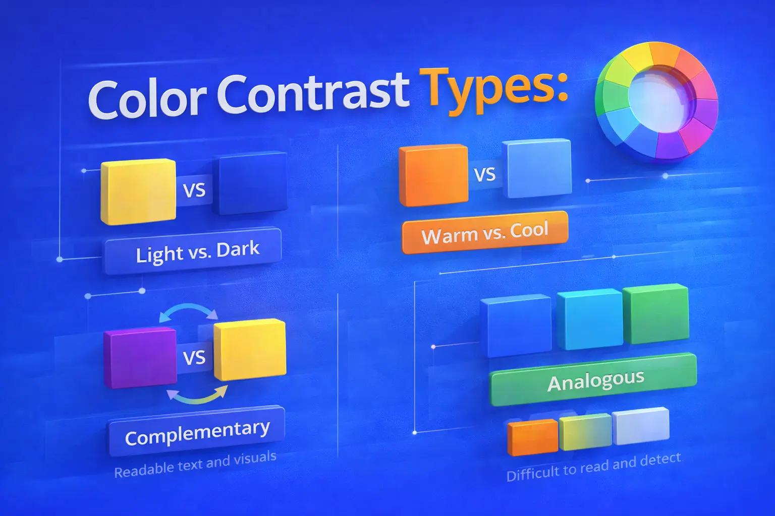
It means using different shades, tints, and tones of a single color, allowing you to create a unified look.

  • Easy on the eyes, simple, and clean for users.
  • If not properly balanced, it may feel flat to users.

2. Analogous

Uses hues that are adjacent to one another on the color wheel, helping you achieve smooth color flow.

  • Harmonious and organic for users.
  • Popular in designs inspired by nature.

3. Complementary

Uses colors that are opposite one another on the color wheel, helping you create strong contrast.

  • Provides excellent visual impact and contrast for users.
  • Perfect for highlighting call-to-action buttons.

4. Triadic

Uses three colors from the color wheel that are evenly spaced, giving you a balanced color palette.

  • Bright and well-balanced for users.
  • Commonly used in branding and illustrations.

What is color contrast?

What is Color Contrast?

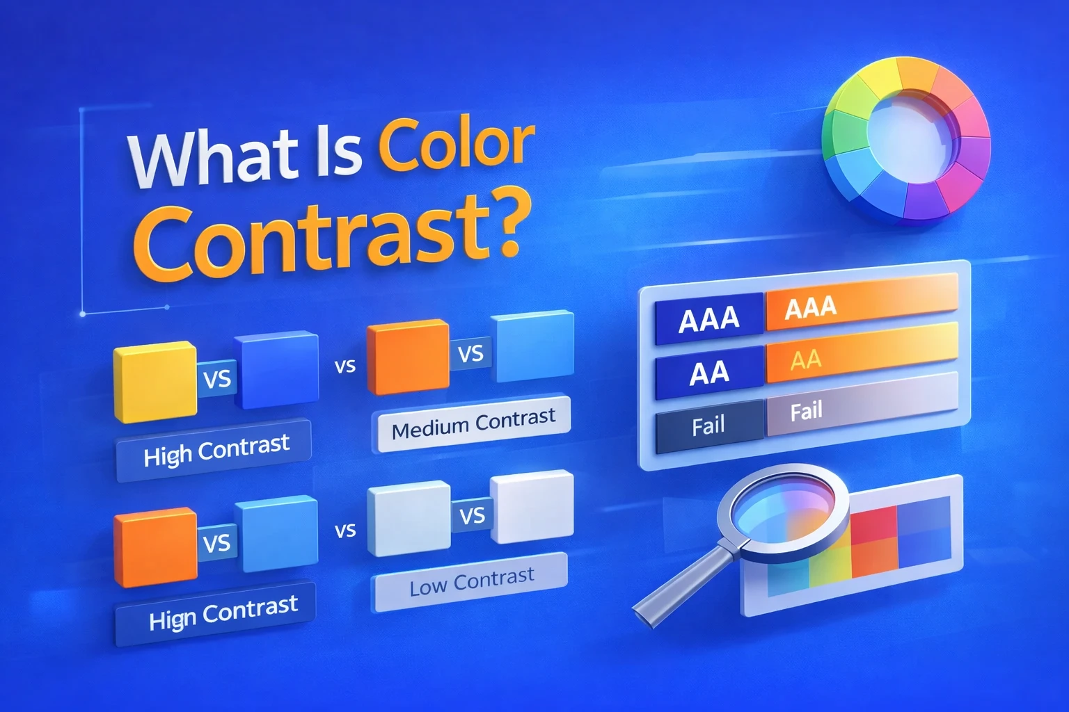
The difference between two or more colors used together—usually between text and background or important design elements—is known as color contrast.

  • On desktop, mobile, and low-light screens, proper color contrast helps you improve readability for users.
  • It makes content easier for users to read and helps reduce eye strain.
  • With strong contrast, users can quickly scan text and recognize key elements.
  • For users, dark text on a light background is easier to read than light text on a light background.

Color contrast and accessibility

Color Contrast & Accessibility

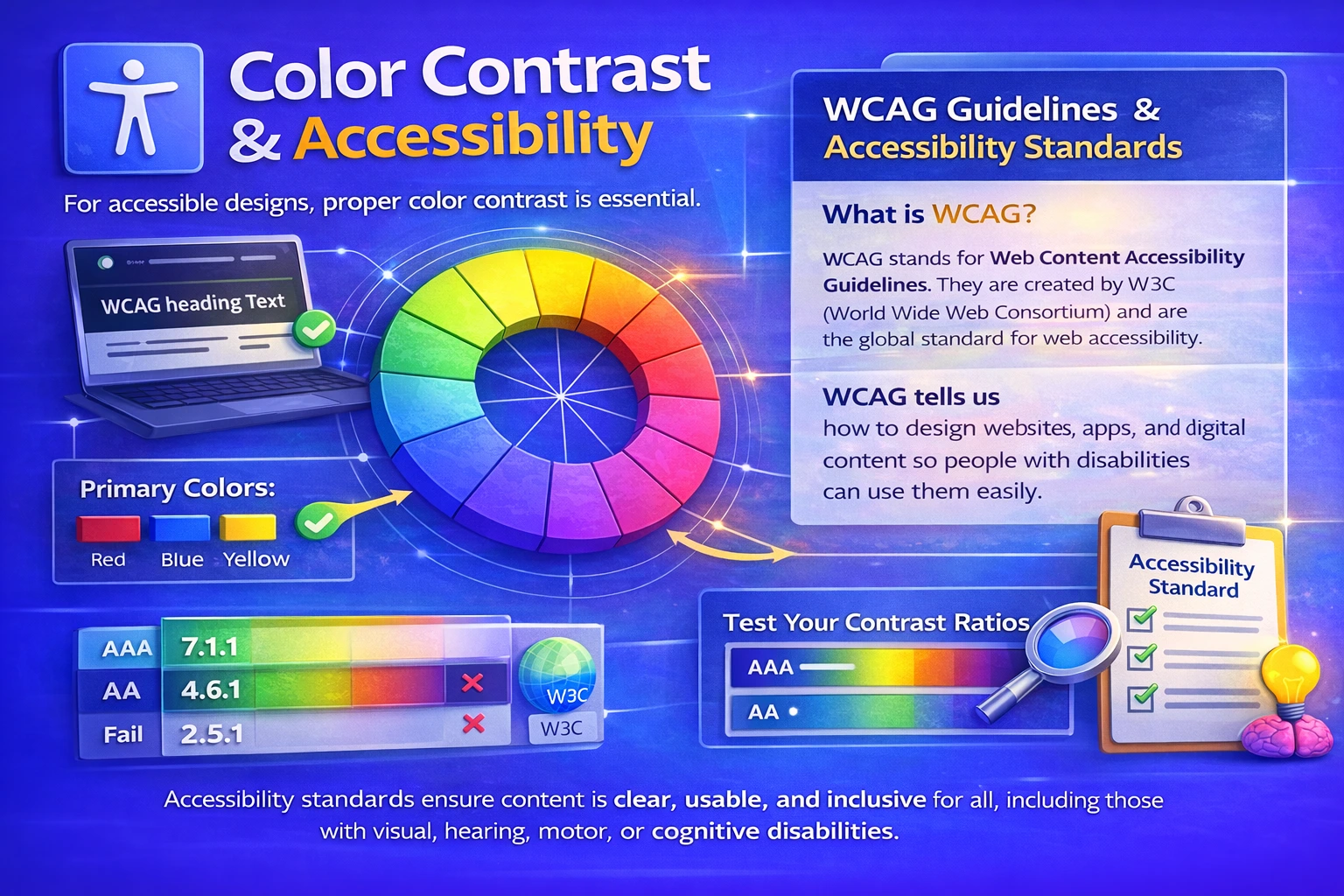
To make designs accessible to all users, color contrast is essential. When contrast levels are too low, users with color blindness or visual impairments may struggle to read content. By using proper contrast, you ensure that text, buttons, and important elements are visible and usable for everyone.

  • Makes it easier for users with limited eyesight to read articles.
  • Supports WCAG guidelines and other accessibility standards that you should follow.
  • Improves usability for users across different devices and lighting conditions.
  • Contrast ratios should be tested by you to ensure accessibility compliance.

What is WCAG?

WCAG stands for Web Content Accessibility Guidelines. They are created by W3C (World Wide Web Consortium) and are the global standard for web accessibility.WCAG tells us how to design websites, apps, and digital content so people with disabilities can use them easily.

4 Core WCAG Principles (POUR):

  • Perceivable:Content must be seen or heard clearly.
  • Operable:Users must be able to use and navigate the content.
  • Understandable:Content should be easy to understand.
  • Robust:Content should work with technological aids.

Purpose of color contrast

Purpose of Color Contrast

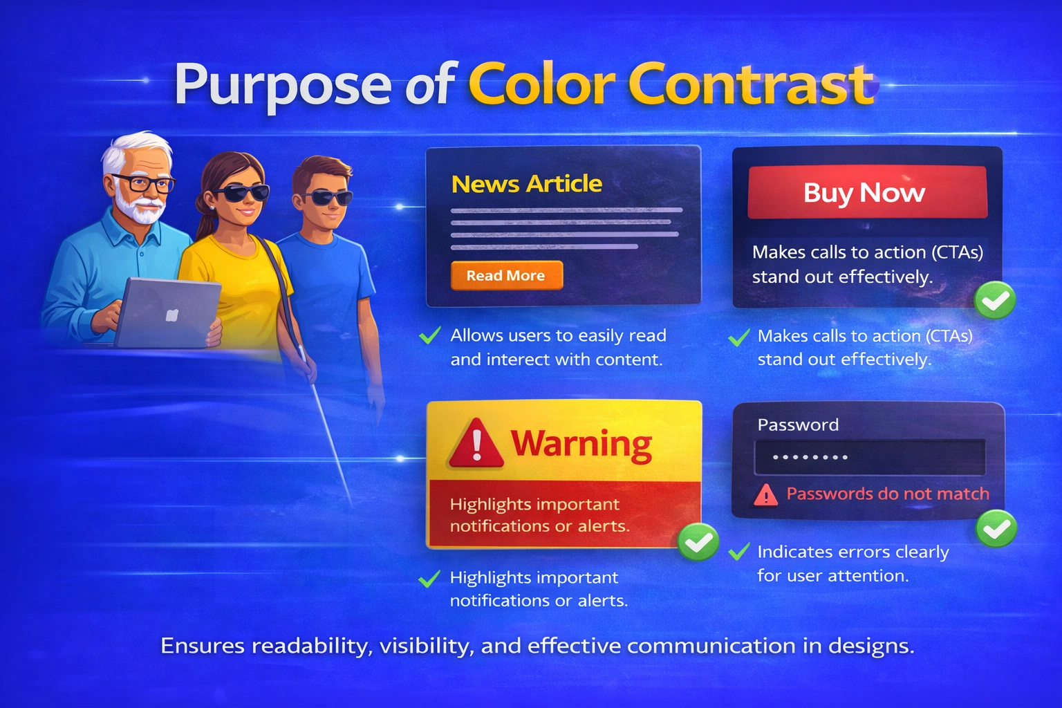
The way you see a design is strongly influenced by color contrast. It has an impact on how simple it is to understand and engage with content on a visual, app, or website.

  1. Helps You Read Content Easily

You don’t have to strain your eyes to read text when there is good color contrast.
For example:

      • It seems warm to have dark lettering on a light background.
      • Text with little contrast makes you zoom in or stop reading.

The design is working if you can read with ease.

  1. Makes Content Accessible for Users

Not every user has the same perception of color. A few users have:

      • Low vision.
      • Blindness to color.
      • Age-related visual problems.

Every other user will be able to get the same information without any obstacles if the color contrast is appropriate.

  1. Guides Your Attention Naturally

Contrast enables your eyes to quickly identify what’s crucial:

      • Headings and Buttons.
      • Crucial messages.
      • Areas with calls to action.

 Contrast directs you automatically, so you don’t need to hunt.

  1. Improves Your Overall Experience

When everything is clear and visible: 

      • You feel comfortable using the interface
      • It feels easy to navigate.
      • You remain on the page longer.

Your user experience is directly enhanced by good contrast.

  1. Helps You Understand Content Structure

    Color contrast helps you quickly identify:

        • What is a heading
        • What is body text
        • What actions you should take

    This creates a clear visual hierarchy, so you can scan content faster.

  2. Builds Trust in the Design You Use

    When contrast is done well, the design feels:

        • Professional
        • Reliable
        • Well thought out

    As a user, you trust such designs more.

  3. Works for You in Any Environment

You may use a device:

      • In bright sunlight
      • At night
      • On a small or low-quality screen

High contrast ensures you can still see everything clearly, no matter the condition. 

Tips for using color contrast effectively

Tips for using Color Contrast effectively

Designs with good color contrast are easier for users to read and utilize.

  • Pay attention to readability:The design is ineffective if users are unable to read your text easily. Make use of distinct light-dark combinations.
  • Observe accessibility guidelines:To ensure that your information is accessible to all users, you must stick to WCAG contrast ratios.
  • Don’t depend solely on color:Some people are unable to distinguish between colors. In addition to color, use text, icons, or shapes.
  • Direct the user’s focus:To help users know where to look, utilize a sharp contrast for buttons, headlines and critical activities.
  • Take a real user test:Examine your design in bright, low, and mobile light.
  • Don’t use too much contrast:Users may become confused by excessive contrast. Use it only where attention is needed.

Uses of color contrast:

Uses of Color Contrast

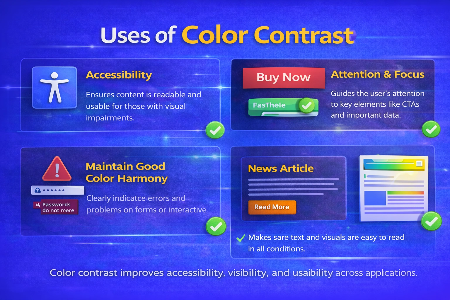
You may make designs that are easy for users to perceive, read and use by using color contrast.

  • Enhances readability: Makes it easier for users to view text without straining their eyes.
  • Encourages accessibility: Enables you to create content that is accessible to all users, including those with low vision.
  • Focuses attention to key components: Directs the user’s focus to important actions, buttons, and headings.
  • Establishes a unique visual hierarchy: It helps readers in determining where to concentrate and what to read first.
  • Enhances the user experience: Promotes user navigation and interaction with your design.
  • Minimizes errors and misunderstandings: Makes sure users ignore crucial messages or warnings.
  • Works under actual circumstances: Allows viewers to see material in bright light or on mobile smartphones.

Color contrast types

Color Contrast Types

1. Light and Dark Contrast

You can use light text on dark backgrounds, or dark text on light backgrounds. This approach is common in web and user interface design and helps users read content easily.

2. Hue Contrast

You can separate elements by using different hues, such as orange and blue, making it easier for users to distinguish between components.

3. Saturation Contrast

To draw users’ attention, you can contrast muted colors with more vibrant ones.

4. Size and Color Contrast

You can combine font size and color contrast to create stronger emphasis and guide users toward important information.

Why color theory and color contrast matter together

Why color theory and color contrast matter together

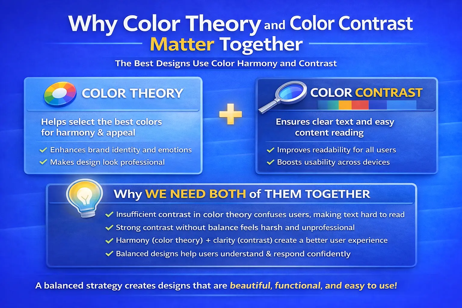
Although being totally separate concepts, color theory and color contrast work best together to produce the finest design outcomes. While color contrast guarantees that every user can see, read and interact with the design with clarity, color theory aids in color selection.
When we strike a balance between the two, we produce designs that are aesthetically pleasing, practical, and easy to use.

Why We Need Both of Them Together:

  • Users may become confused and find it harder to read if there is insufficient contrast in the color theory.
  • Users might see strong contrast without color balance as unpleasant or unprofessional.
  • Users have a more seamless experience when harmony (color theory) and clarity (contrast) are combined.
  • A balanced strategy enables consumers to comprehend information more quickly and respond with surety.

Color psychology in designs

Color Psycholorgy in design

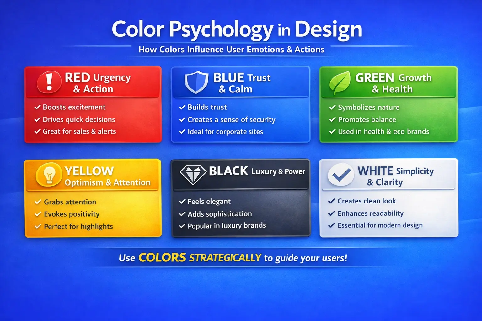
ColorUser EmotionPsychological ImpactBest Use in Design

RedUrgency, PassionTriggers action and excitementCTA buttons, sales, alerts
BlueTrust, CalmBuilds confidence and securityCorporate, finance, healthcare
GreenBalance, GrowthSoothing and eye-friendlyHealth, finance, eco brands
YellowOptimism, EnergyAttracts attention quicklyHighlights, warnings
BlackLuxury, PowerFeels premium and authoritativeLuxury brands, fashion
WhiteSimplicity, ClarityImproves readabilityBackgrounds, minimal layouts

Real brand examples of color theory & contrast

Real Brand Examples of Color Theory & Conttrast

Google:

Google uses high contrast to maintain clarity and usability.

  • Uses a color theory-based primary color scheme consisting of blue, red, yellow, and green
  • Keeps the background and text in sharp contrast
  • The outcome is a clear user interface, high brand recall, and outstanding readability

Netflix:

Netflix uses bold contrast to drive attention and engagement.

  • Red, black, and white are the predominant hues
  • Black adds depth, while red conveys intensity and emotion
  • Buttons and text stand out clearly when there is high contrast


Instagram:

Instagram balances creative colors with readable UI elements.

  • Utilizes a gradient color scheme (orange, pink, and purple)
  • Contrast is maintained by positioning white or black UI elements on top
  • Develops a modern and identifiable brand identity


Spotify:

Spotify applies contrast carefully, especially in dark mode.

  • Uses black and green as its brand colors
  • Carefully applies contrast to CTAs, icons, and text
  • Increases visibility even in dark mode

Dos & don’ts of color theory & color contrast:

Dos:

  • Apply color theory to select balanced color palettes that help you create visually pleasing designs.
  • Keep strong contrast between text and background so users can read content easily.
  • Test colors on different screen sizes and devices to ensure consistency for users.
  • Use contrast to highlight CTAs and important text, guiding users’ attention effectively.

Don’ts:

  • Avoid using light text on light backgrounds, as it makes content difficult for users to read.
  • Do not rely on color alone to communicate ideas—support it with text or icons for users.
  • Avoid overusing fluorescent or extremely bright colors, which can overwhelm users.
  • Do not ignore contrast when choosing brand colors, as it affects usability for users.
  • Do not sacrifice readability for aesthetics, as users value clarity over decoration.

Practical uses:

  • Applied to UI and UX design of websites to improve user experience.
  • Used in branding and logo creation to build strong brand identity for users.
  • Applied in digital advertisements and mobile apps to attract and guide users.
  • Useful for banners and call-to-action buttons to encourage user interaction.

Common mistakes:

  • Using light text on light backgrounds, which makes your content hard for users to read.
  • Overusing vivid or fluorescent colors, which can confuse users.
  • If You are neglecting contrast in brand colors, reducing clarity and usability for users.
  • Using color alone to communicate information, which can confuse users or limit accessibility.

Conclusion

Effective design is strongly built on color theory and color contrast. Color contrast helps you ensure clarity, readability, and accessibility for users, while color theory helps you choose color combinations that are visually appealing and emotionally meaningful. When you apply both together, they strengthen branding, improve digital performance, and enhance user experience. Designers who understand and use these principles can create designs that are not only attractive but also practical, user-friendly, and ready for the future.

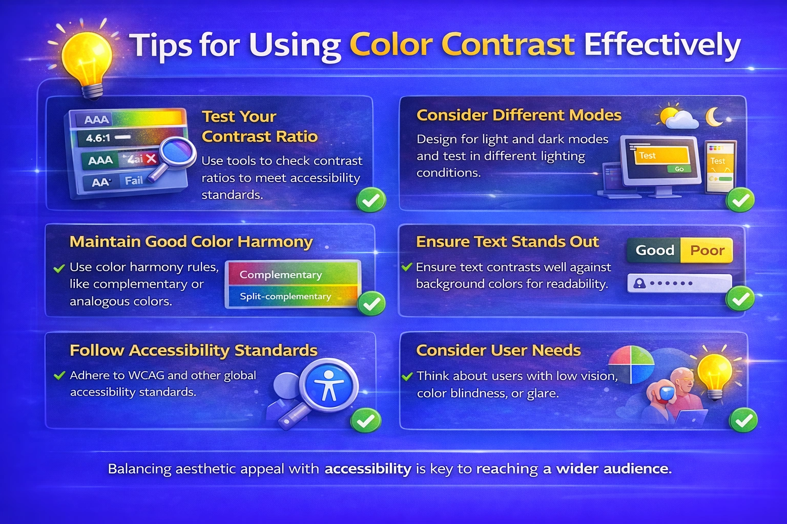
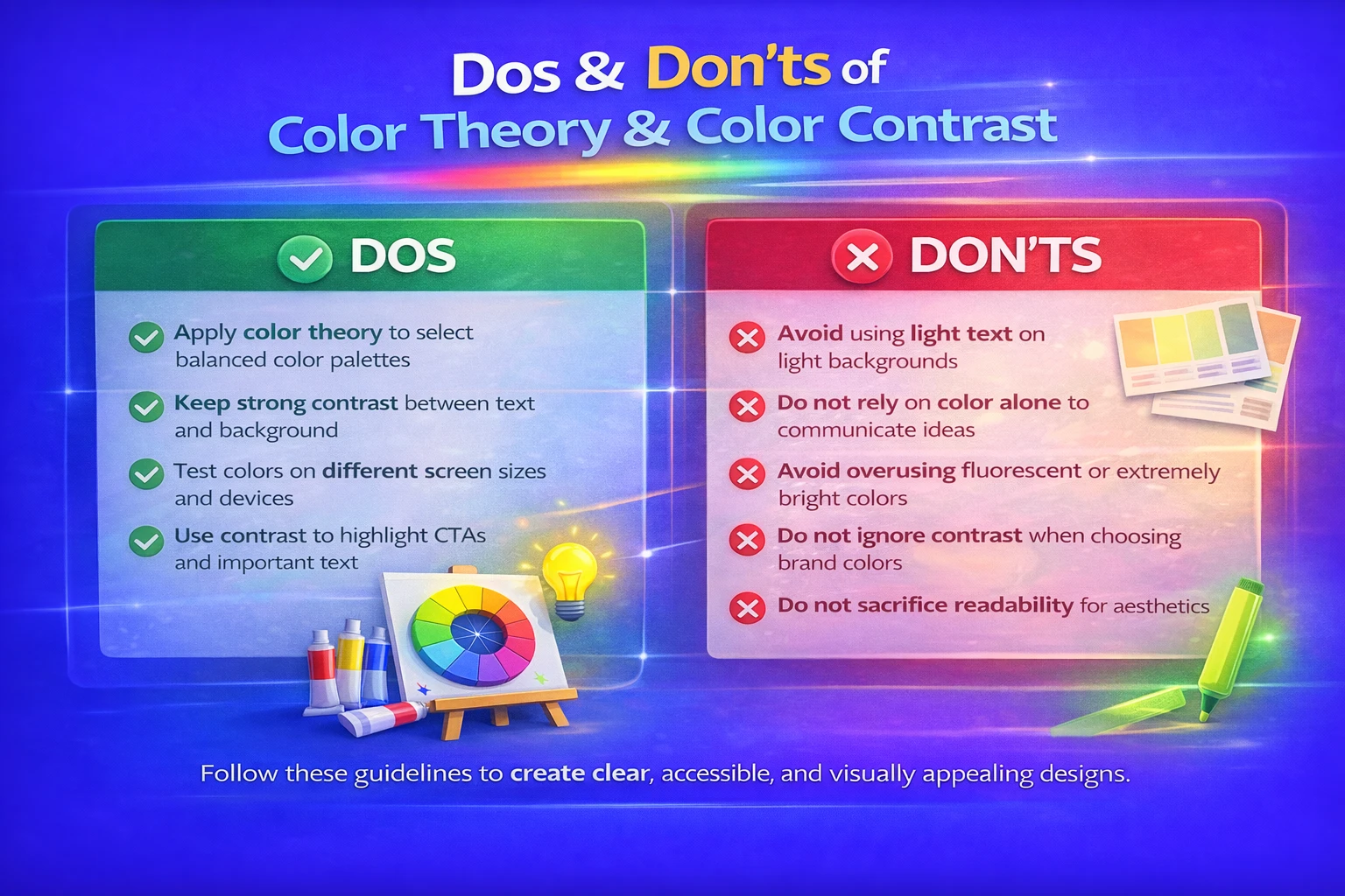
Before completing a design, always test color contrast across devices.

FAQ's

How can I check if my color contrast is adequate?

To determine whether foreground (text) and background colors match to accessibility guidelines (such as WCAG), you can utilize online contrast tester tools. For the majority of users, a good contrast ratio guarantees readability.

What practical tips can help me choose better colors?

Start with a small palette, test contrast across devices, balance bright and neutral tones, use the color wheel for harmony, and take the target audience and cultural significance of color into account.

Can too much contrast be bad?

In fact, people may become confused by a design that has too much contrast in every area. Use of contrast should be carefully chosen particularly for important components like calls to action.

How do color and contrast impact user experience (UX)?

A logical and enjoyable user experience is the result of well-chosen color schemes that can direct attention, make content easier to read, enhance navigation and create a consistent visual identity.

What should beginners avoid when working with colors?

Avoid choosing too many vivid colors at once, very light text on light backgrounds and color selection based only on taste without taking balance or clarity into account.

Leave a Reply

Your email address will not be published. Required fields are marked *

3 Days Free Demo Classes!

Join DMindX today and say goodbye to unemployment...

demo classes 3d icon
Rate this post

Leave a Reply

Your email address will not be published. Required fields are marked *

Benefits:

Book Free Demo Classes!

Hey👋, Fill This Form:

The Boucher will be send on the filling Whats App, Make Sure It's Correct!