Book You're Free Demo Classes Today!
Join Best Digital Marketing Institute of Patiala!
Typography is the art of arranging text such that it is readable, visually appealing, and meaningful for both you and us as designers and content producers. It involves more than just picking lovely typefaces. You can read content more quickly, remain engaged for longer and have greater faith in the message we are conveying when typography is done correctly. In today’s digital age, typography is critical to user experience, branding, and SEO since it greatly influences how consumers interact with material. This article will assist you in comprehending typography by outlining its fundamental meaning, key elements, primary types, typical mistakes, and useful uses in contemporary brand and web design.
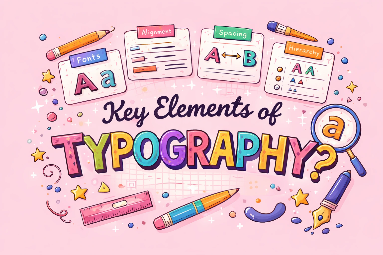
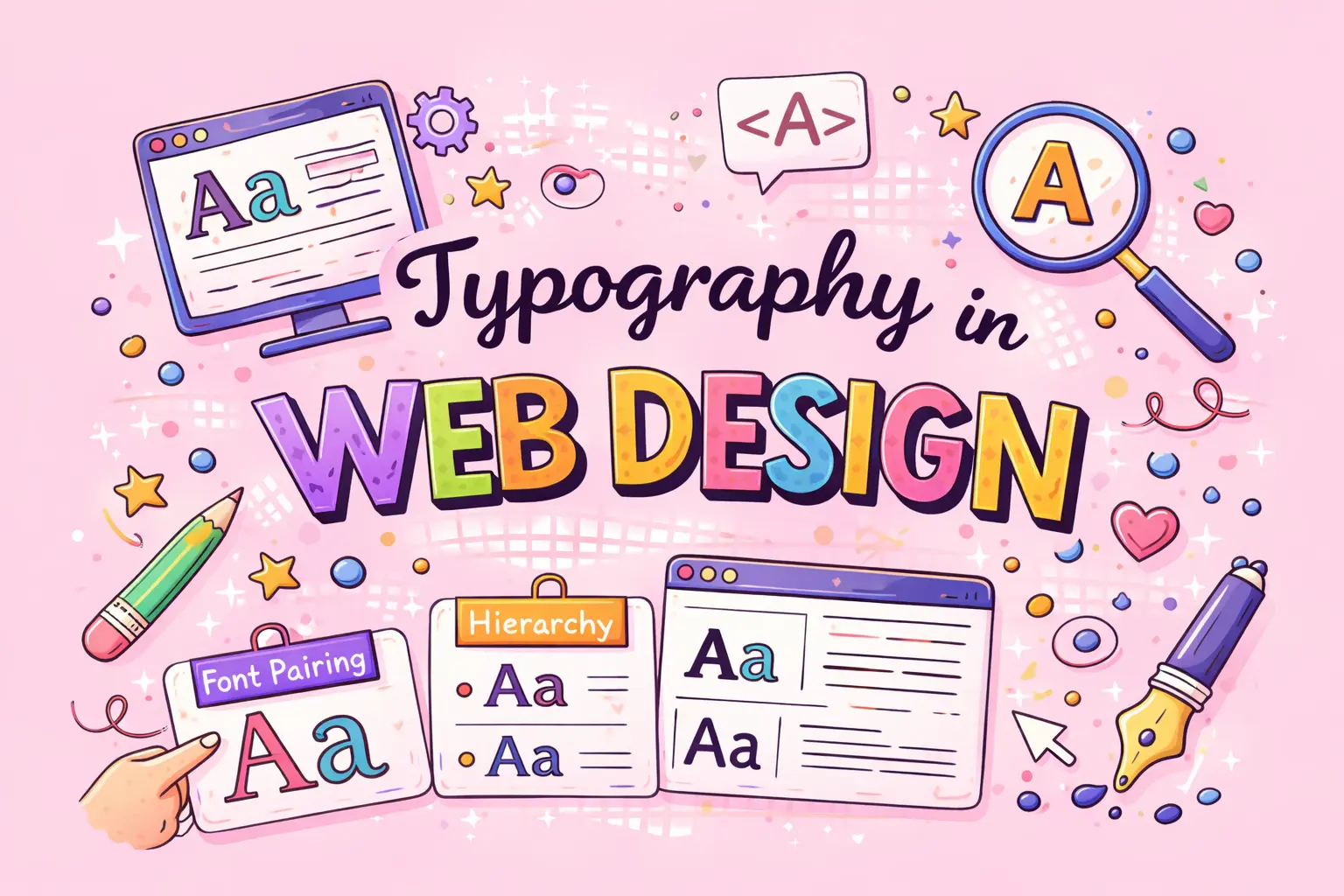
The style, appearance, and arrangement of text are referred to as typography that you and other users see and interact with. In order to increase readability and visual balance, we work with typefaces, font size, line height, letter spacing, and text alignment.
Simply put: Typography helps you and us turn plain text into clear, engaging communication.
Effective typography directs your attention as a user, establishes structure, and ensures the content we create feels polished rather than disorganized or unclear.
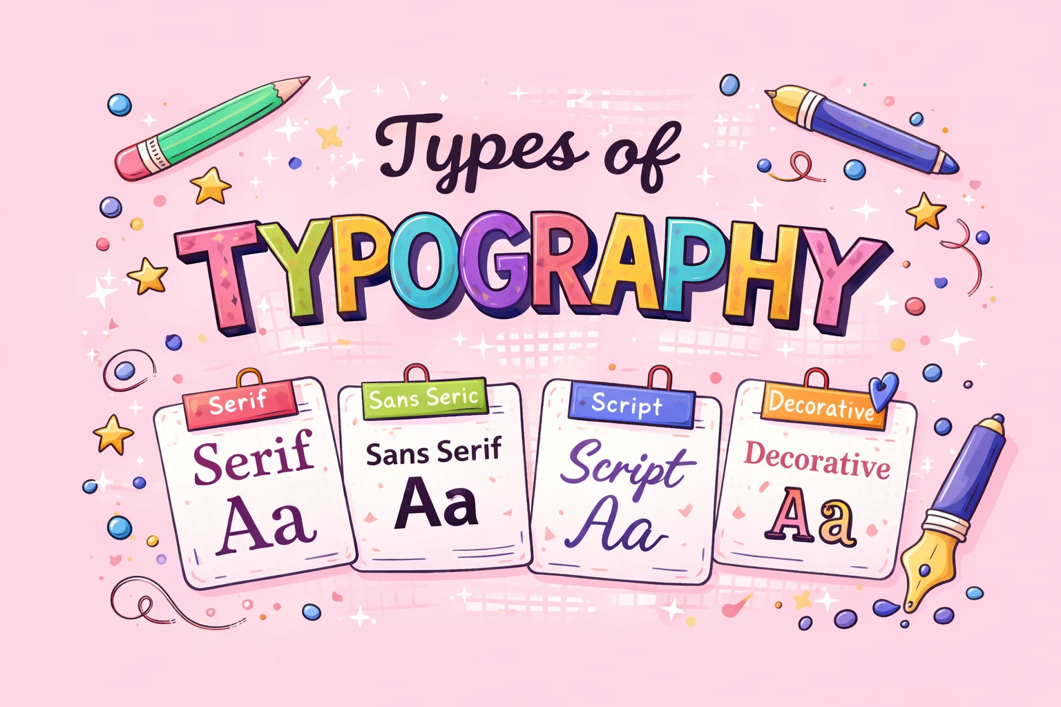
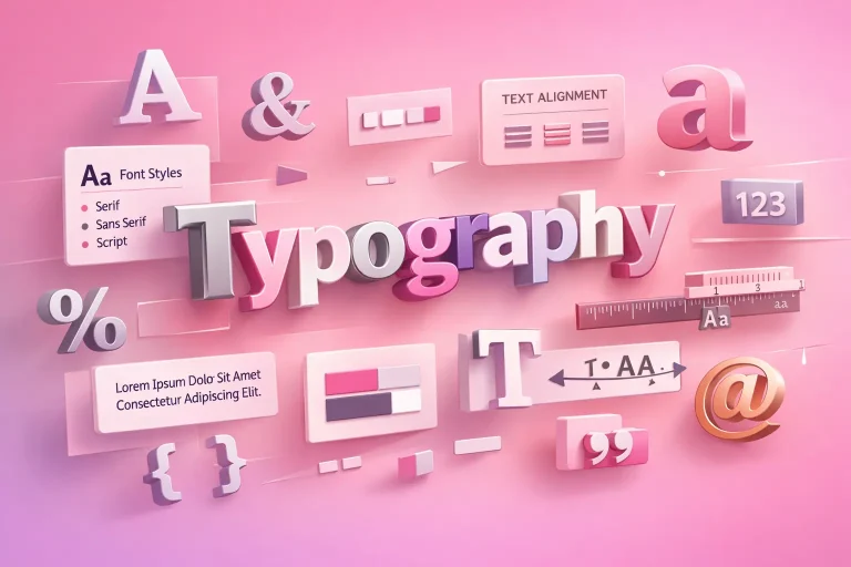
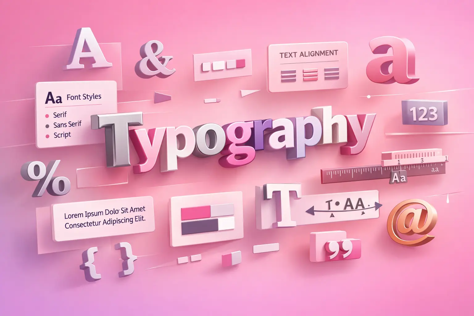
Serif typefaces use small strokes at the ends of letters. You will often see them used in long-form content and print reading.
Types: –
They are comfortable for you to read over long periods in print because the tiny strokes help guide your eyes smoothly across lines of text.
Sans-serif typefaces have a clean, modern look because they do not include strokes. You will see them used widely in digital design.
Types: –
Companies like Google and Apple choose sans-serif typefaces because they give you better screen readability, especially on smaller devices.
Script typefaces are mainly decorative and are designed to mimic handwritten or calligraphic styles.
Types: –
You can use them effectively for titles and headings, but because they are harder to read, they are not suitable for long passages of text.
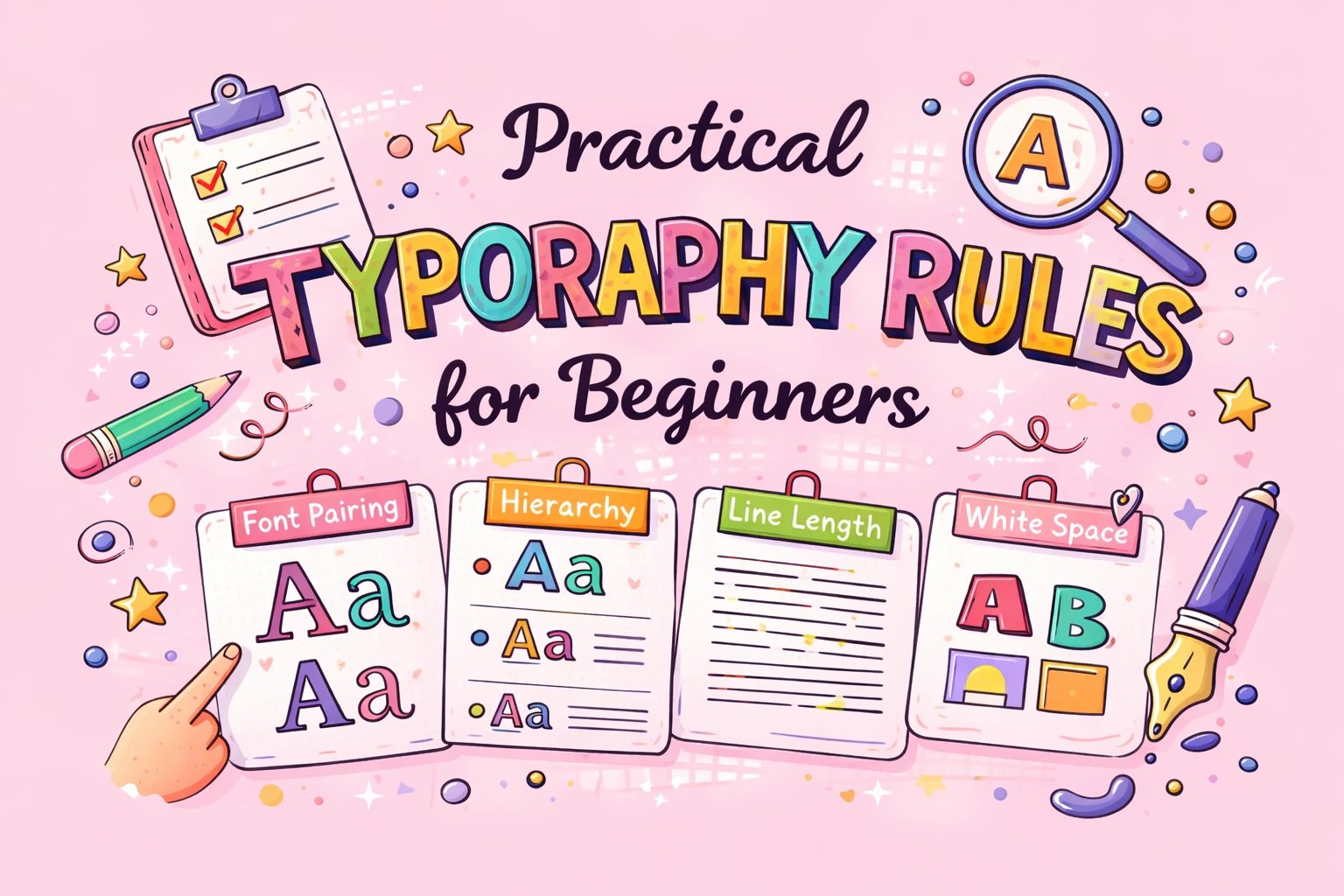
You should avoid using more than two fonts in a single design to maintain consistency and clarity.
Make sure your heading fonts and body text fonts clearly stand out from one another so users can easily understand the content structure.
When designing for the web, you should keep line height between 1.4 and 1.6 to improve readability on screens.
You should stay away from overly decorative or fancy fonts in body paragraphs, as they can make reading difficult for viewers.
Always test your typography on mobile devices to ensure that text remains readable and visually balanced on smaller screens.
Effective web typography ensures the following for your users:
Enhanced legibility and readability, allowing users to absorb content quickly.
Better accessibility, faster reading and increased user confidence while navigating your website.
Improved accessibility through the use of readable fonts and proper contrast, helping users with visual impairments.
Quicker content absorption which reduces memory load and eye strain for readers.
Lower bounce rates because visitors are more likely to remain on a visually well-designed page.
Increased credibility and consumer trust due to the professional look created by clean typography.
A better mobile experience through responsive font sizes that adapt to different devices.
A clearly defined content hierarchy that guides readers using headings and varied font sizes.
Stronger engagement signals, such as time on page and scroll depth, which help improve your SEO rankings.
Higher conversion rates because readable and well-structured content encourages users to take action.
In brief, effective typography directly influences how users engage with, understand, and trust your website.
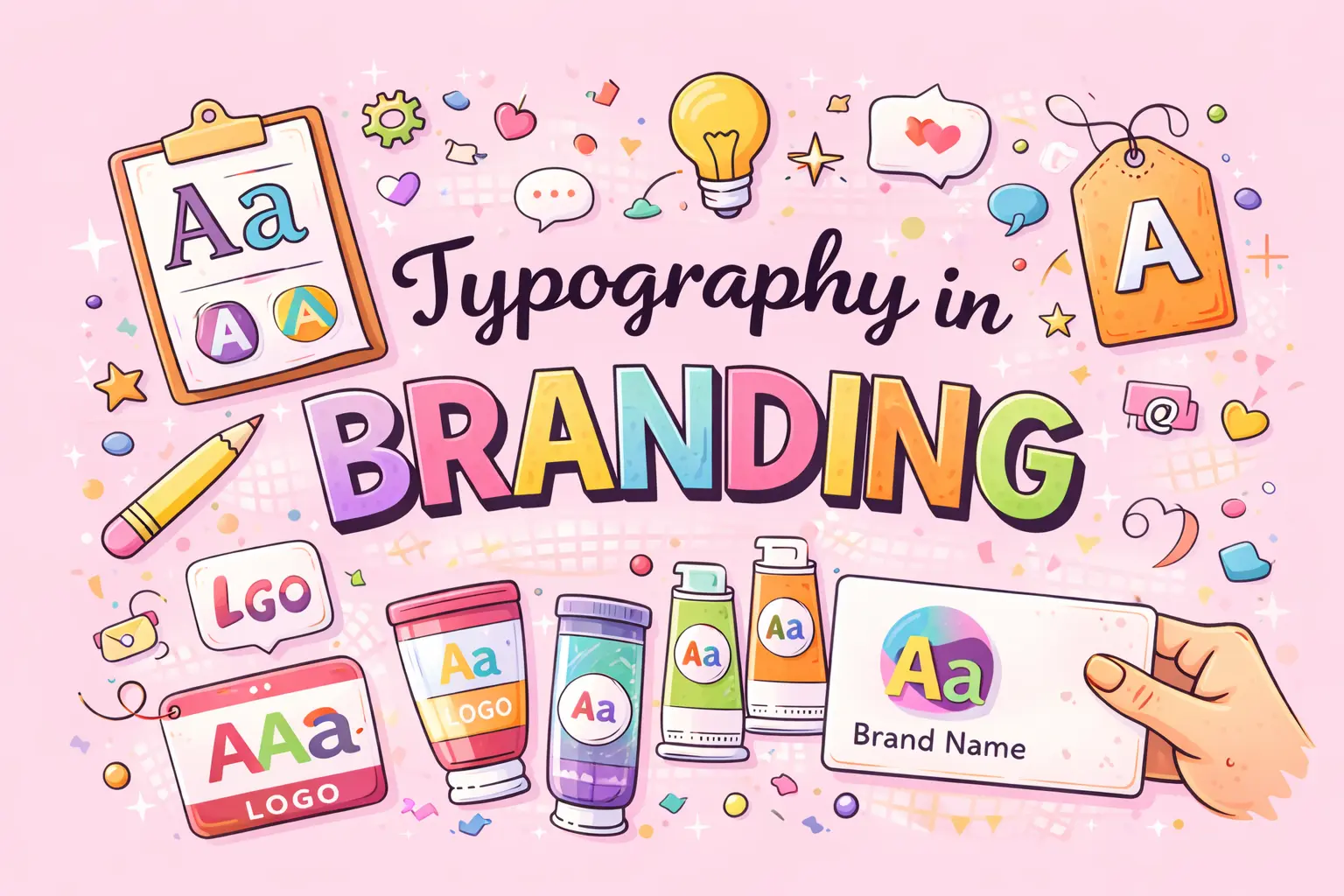
When utilized carefully and consistently, typography is an effective branding tool. It influences how your brand’s appearance, emotions, and audience communication.
You should slect fonts that reflect the brand’s values and tone:
Serif fonts help you convey trust, tradition, and authority.
Sans-serif fonts give your brand a modern, clean, and digital feel.
Script fonts allow you to express creativity, elegance, or luxury.
Display fonts help you deliver bold and attention-grabbing messaging.
Over time, consistent typography helps you build strong brand recognittion and trust.
By choosing the right typography, you enhance the emotional tone of your brand messaging and strengthen how users connect with your brand.
| Brand | Font Type Used | Typography Style | Brand Message Communicated |
|---|---|---|---|
| Sans-serif | Clean, simple | Simplicity, accessibility, innovation | |
| Apple | Sans-serif | Minimal, elegant | Premium quality, sophistication, trust |
| Coca-Cola | Script | Flowing, expressive | Emotion, tradition, happiness |
| Nike | Sans-serif | Bold, strong | Confidence, energy, performance |
| Netflix | Sans-serif (custom) | Modern, bold | Digital-first, clarity, scalability |
| Vogue | Serif | High-contrast, refined | Luxury, fashion authority, elegance |
| Amazon | Sans-serif | Functional, readable | Reliability, usability, customer focus |
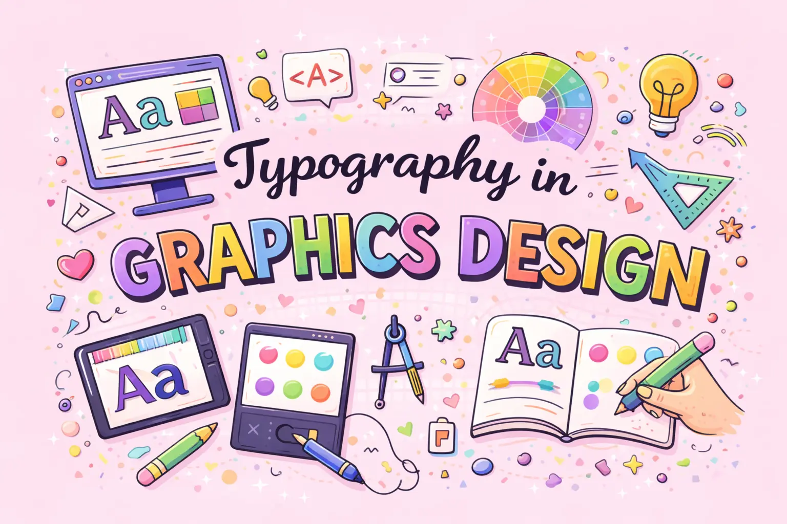
Typography is a fundamental part of graphic design because it helps you communicate ideas, emotions, and messages visually. In graphic design, typography is not just about reading text—it is also about expression, balance, and visual impact. By choosing the right typography, you can guide viewers through a design, grab their attention, and clearly convey meaning.
Typography’s Significance in Graphic Design:
How Typography is Used in Graphic Designing
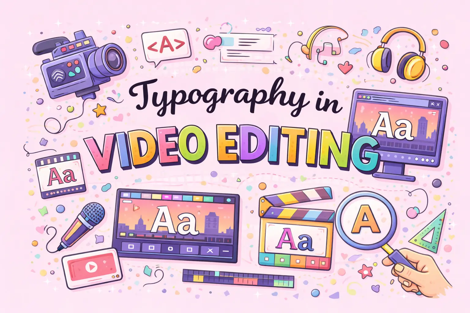
In video editing, typography plays a key role in viewer engagement, clarity and storytelling. When you add text to videos, it helps you deliver messages quickly, strengthen branding, and guide viewers through visual information. Well-designed typography also enhances the emotional impact of a video and keeps viewers interested.
The Value of Typography in Video Editing
The Use of Typography in Video Editing
Lower Thirds: Display names, roles, or key information in the lower part of the screen.
Subtitles & Captions: Improve accessibility and increase watch time for viewers.
Call-to-Action Text: Encourage actions such as liking, sharing, subscribing, or purchasing.
Kinetic Typography: Animate text to express emotion, energy, and emphasis.
Methods of Typography in Video Editing:
To make typography effective, you should:
Common Typography Mistakes (and Why They Matter)
You should avoid these common errors:
Typography Trends in Modern Design
When you work with typography in modern design especially for videos. You should keep an eye on the following trends:
Variable fonts give you greater flexibility and adaptability across different screen sizes and design needs.
Mobile-first typography ensures that text remains readable and visually balanced on smartphones and smaller screens.
Accessibility-focused font choices help you make content usable for everyone, including users with visual impairments.
Dark-mode friendly typography allows your text to remain clear and comfortable to read in low-light interfaces.
Beyond just choosing a typeface, typography is a potent design component. When used properly, it increases readability, builds up branding, improves user experience and develops trust. Gaining ability in typography becomes essential for communicating ideas effectively and professionally, whether you are designing a website, producing promotional materials or developing a brand.
Typography helps you improve appearance, readability, and overall communication in your designs.
A font is a particular style within a typeface, which is a family of fonts.
For web readability, You can use sans-serif fonts.
We should use one for body content and one for headings is ideal.
Table of Contents:
Join DMindX today and say goodbye to unemployment...
Digital Marketing India Experts, is best institute for learning innovative strategies, Web-Designing, SEO, PPC, SMM, SMO, Graphic Designing, Video Editing.
Copyright © 2025-2026 Digital Marketing India Experts All Rights Reserved
Benefits:
Book Free Demo Classes!
Hey👋, Fill This Form:
The Boucher will be send on the filling Whats App, Make Sure It's Correct!